
Kassy Raymond, Fellow, Datasphere Initiative
Data is more than a spreadsheet
If we close our eyes and think about data, we are likely to envision the columns and rows of numbers that make up a spreadsheet. If we take our thinking a step further, we might realize those numbers might belong to someone, are stored somewhere, and might be used in estimates and models that we use to understand our world.
If we approach data as consumers and creators of data, we are interested in how our data moves and interacts with the world; broadly, we want to know how it is used, by whom, and for what purposes.
However, when we reframe our thinking about data, we realize that data is much more than a spreadsheet; it is a powerful connected set of entities that has a great impact on the way that we view the world, the way that we make decisions and policies, and how we advance knowledge and innovation.
When we start thinking about data as concepts and connections with consequences, we can start breaking data silos, realize new opportunities data could point us to, and understand the overlaps and chilling effects in the rules defining data sovereignty and interoperability.
How data are connected
Currently, most data are scattered across the web with no clear way of understanding the relationships that tie them together. However, the data are intrinsically linked through the way that they are described.
For example, data is connected to:
- Its original owners and creators
- The funders that facilitate its creation, storage, use, and dissemination
- The licenses that govern its use
- The machines that store and disseminate it
- The websites and platforms that host it
- The people that use it
- The policies that cite it
- The countries, cities, and regions that it represents
- The articles, reports, and written communications that apply it
And each of these entities are connected to each other through their relationship to the data.
Data as a graph
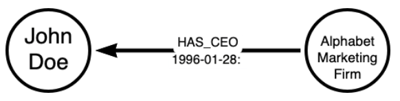
Graphs are made up of two main components: nodes and relationships (or links). Nodes are nouns and relationships are verbs. Nodes are connected to other nodes via relationships. To provide more information, properties can be added to nodes and relationships.
Here, we have a simplistic example of a graph that shows that John Doe has been employed at Alphabet Marketing as a CEO since January 28, 1996.
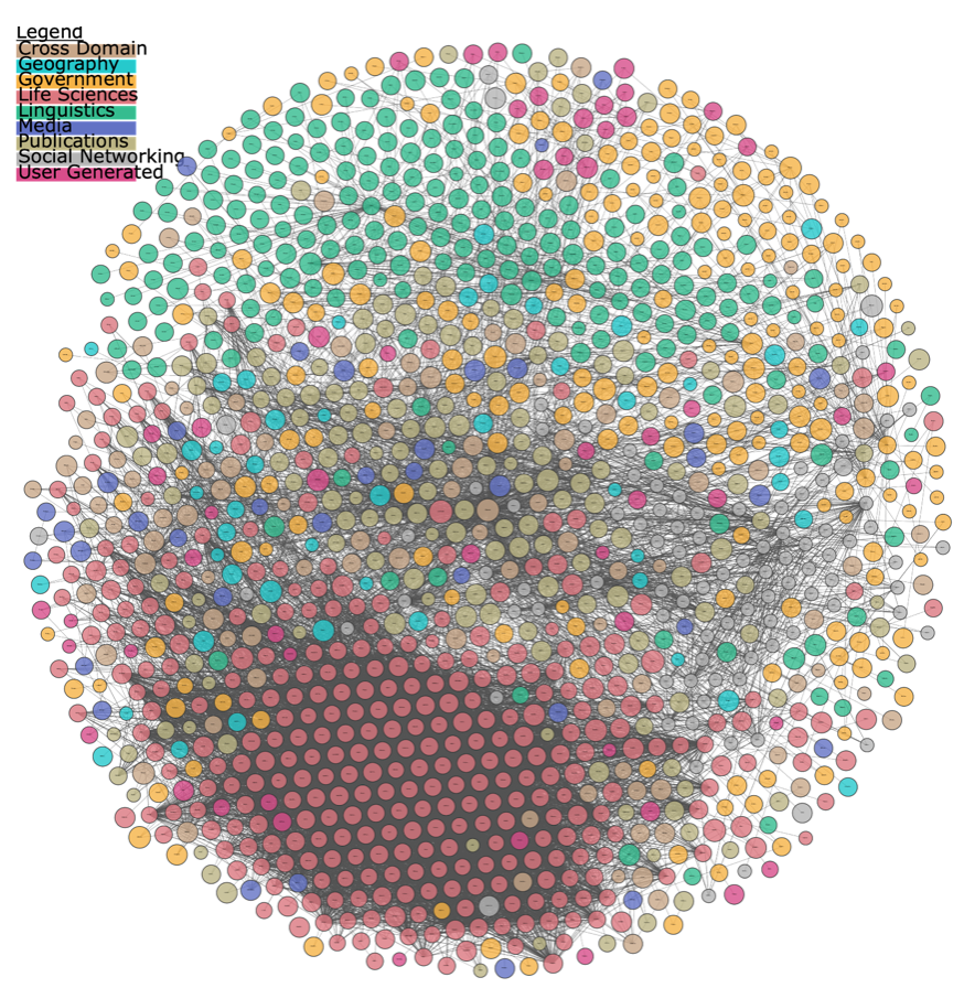
We can apply this to data by projecting the connections of data into a graph. For example, The Linked Open Data Cloud connects related data, allowing for understanding and visualization of how datasets are linked to each other.
The projection quickly communicates how interconnected the data are, and provides an opportunity to understand patterns and trends in the data that would otherwise be invisible. You can interact with the visualization to determine which datasets are connected, improving the discoverability of datasets linked in the cloud. Scientific and historical trends can be communicated via data visualization, allowing policy and decision makers to identify cause and consequence of events related to data-based policy interventions.
How graph databases help us understand data
1. Visualization of data
The relationships that form data are vast and complex. It is hard to comprehend the complex systems around data when we describe them in words and try to read a spreadsheet. By visualizing data in the Datasphere 1 as a graph, we are able to start reframing our thinking about data as connected entities and change the narrative of data through understanding who it impacts, who uses it, and how it relates to each other.
Data visualization allows data to be interpreted in a more clear and accessible way, providing users with a visual story of what the data are telling us. For instance, through connecting data sources and visualizing them in a graph, such as in the Linked Data Cloud, we are quickly able to understand that data exist in a complex system and are connected to each other. By interacting with the visualization, users can reflect on the data and ask specific questions, revealing new narratives about the data which wouldn’t otherwise exist.
2. Reveal trends and uncover patterns in the data
By connecting data, we can understand commonalities between data sources and how they are used that may not be otherwise apparent. We can apply network analysis to study questions about data systems. For example, we can begin to ask the following questions:
- Where can data resources be found and accessed?
- Who uses data and for what purposes?
- Who are the key stakeholders of the data?
- What are the common standards used in data and metadata?
- How are data described in different domains?
- What are the main funding sources of data?
- Where are data siloed and what are the commonalities between the data?
- How does the graph show power dynamics?
- What are the main data gaps in each domain?
- What nodes, or entities, connect the data?
3. Facilitate trust through understanding data flows
Projecting data and its relationships into a graph allows us to see how data flows throughout its lifecycle. Trust in data is facilitated by transparency in how data is used and managed; graph databases provide a medium for building trust through communicating how data is used.
The next steps for graph databases in the Datasphere
Case studies showing the utility of graph databases to understand data between and within different sectors and disciplines will reveal the power of thinking about our data in relationships. My next blog post as a Fellow at the Datasphere Initiative regarding Graph Data in the Datasphere will provide a case study of how the Global Burden of Animal Diseases is using graph database technologies to manage, understand, and visualize data in the livestock agriculture sector.
¹De La Chapelle, B. and L. Porciuncula (2021), “Hello Datasphere”, Datasphere Initiative Medium, https://medium.com/@thedatasphere/hello-datasphere-towards-a-systems-approach-to-data-governance-d602f96c9e1d